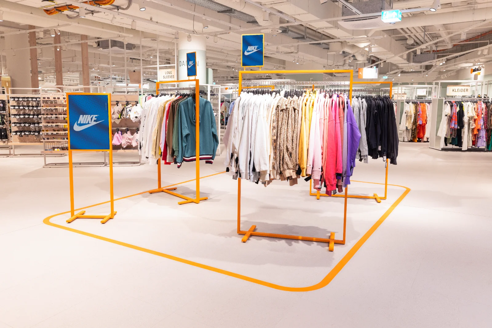
Im Rahmen des Rebrandings betreute ich die monatliche Gestaltung der Welcome Fläche für wechselnde Kampagnen und Produktwelten in den Zalando Outlet Stores.
As part of the rebranding I owned the monthly design of the Welcome Area for rotating campaigns and product worlds across the Zalando Outlet Stores.

Challenge
Zalando Outlet ist die stationäre Outlet-Sparte von Zalando mit mehreren Standorten in Deutschland. Die Welcome Area am Store-Eingang musste monatlich neue Kampagnenthemen aufgreifen und dabei markenkonform, druckfertig und deutschlandweit konsistent bleiben.
Zalando Outlet is Zalando's brick-and-mortar outlet division with several locations across Germany. The Welcome Area at the store entrance had to pick up new campaign themes every month while staying on-brand, print-ready and consistent nationwide.
Goal
Ziel war es, für jede Kampagne Retail Signage, Print Assets und POS-Kommunikation zu entwickeln, die sich schnell produzieren und über alle Standorte hinweg ausrollen lassen - in enger Abstimmung mit Art Direction und Assortment-Stakeholdern.
The goal was to develop retail signage, print assets and POS communication for every campaign that could be produced quickly and rolled out across all locations - in close alignment with art direction and assortment stakeholders.
Result
Ich gestaltete monatlich die Welcome Area für wechselnde Kampagnen, recherchierte und wählte passende Visuals aus und bereitete die finalen Layouts druckfertig auf. In zwei Feedback-Runden pro Kampagne stimmte ich mich mit Art Direction ab, bevor Druckereien und Store-Teams die Umsetzung deutschlandweit übernahmen.
I designed the Welcome Area every month for rotating campaigns, researched and selected suitable visuals and prepared the final layouts print-ready. In two feedback rounds per campaign I aligned with art direction before print vendors and store teams took over the nationwide rollout.
Key TakeawayKey takeawayDie enge Taktung mit monatlich neuen Kampagnen hat mir gezeigt, wie wichtig klare Abstimmungsprozesse und wiederverwendbare Layout-Systeme sind, um Qualität und Markenkonsistenz über viele Standorte hinweg zu sichern.
The tight cadence of monthly new campaigns showed me how important clear coordination processes and reusable layout systems are for securing quality and brand consistency across many locations.

Herrenshorts · Zalando Outlet Karlsruhe · Mai 2025Men's Shorts · Zalando Outlet Karlsruhe · May 2025


Campaign visuals from March/April 2025 before the rebrand - still using the previous corporate typeface and the old Zalando Orange.
Kampagnenvisuals aus März/April 2025 vor dem Rebranding - noch mit der vorherigen Hausschrift und dem bisherigen Zalando Orange.

Kampagnenvisual aus Mai 2025 nach dem Rebranding - mit Zalando Sans und dem neuen Zalando Orange innerhalb des bestehenden Welcome-Systems.
Campaign visual from May 2025 after the rebrand - using Zalando Sans and the new Zalando Orange within the existing Welcome system.
Der Kampagnenstart im Mai 2025 markierte den Beginn des schrittweisen Rollouts der neuen Zalando Brand Identity innerhalb der bestehenden Welcome Fläche - einschliesslich des neuen Zalando Orange und der neuen Typografie.
The May 2025 campaign launch marked the beginning of the gradual rollout of the new Zalando brand identity within the existing Welcome Area - including the new Zalando Orange and the new typography.
In der Explorationsphase wurden unterschiedliche Schriftschnitte der Zalando Sans hinsichtlich Lesbarkeit, Präsenz und Wirkung innerhalb der Retail-Fläche getestet. Dabei wurde bewusst sowohl mit gemischter Schreibweise als auch mit Versalien gearbeitet, um die Fernwirkung und Hierarchie innerhalb der Welcome Fläche vergleichen zu können. Ziel war es, sich von rein versalen Headlines zu lösen und gleichzeitig eine klare, aufmerksamkeitsstarke Kommunikation im Raum beizubehalten.
During the exploration phase, different cuts of Zalando Sans were tested for legibility, presence and impact within the retail context. Both mixed case and all-caps were used deliberately to compare visual reach and hierarchy on the Welcome Area. The goal was to move away from purely capitalised headlines while keeping clear, attention-grabbing communication in space.


Nach dem Vergleich unterschiedlicher Schriftschnitte fiel die finale Entscheidung auf Zalando Sans Regular Extended. Die Schrift überzeugte durch ihre klare Lesbarkeit, starke Präsenz im Raum und ihre konsistente Wirkung innerhalb der bestehenden Welcome-Systematik.
After comparing the different cuts, the final decision was Zalando Sans Regular Extended. It convinced with clear legibility, strong presence in space and consistent behaviour within the existing Welcome system.
Die bestehenden Brandfarben von Zalando wurden auf das bereits definierte Kommunikationssystem der Welcome Fläche übertragen. Dabei bestand meine Aufgabe darin, das neue Zalando Orange innerhalb des bestehenden Pill-Systems konsistent für unterschiedliche Produktgruppen und Kampagnen anzuwenden.
Zalando's existing brand colours were applied to the established Welcome communication system. My job was to roll out the new Zalando Orange consistently across the existing pill system for different product categories and campaigns.
Primärfarbe - Zalando Orange Die von Zalando definierte Brandfarbe Orange wurde auf das bestehende Welcome-Konzept übertragen und innerhalb des Pill-Systems zur Hervorhebung von Produktgruppen und Kampagnenthemen eingesetzt.
Primary colour - Zalando Orange Zalando's defined brand orange was applied to the existing Welcome concept and used within the pill system to highlight product groups and campaign themes.
Sekundärfarben - Schwarz & Weiss Schwarz und Weiss ergänzten das bestehende Farbsystem und unterstützten die visuelle Differenzierung innerhalb der Kommunikation sowie eine klare Hierarchie auf der Fläche.
Secondary colours - Black & White Black and white complemented the existing colour system and supported visual differentiation within the communication, as well as a clear hierarchy on the surface.

Das Farbsystem wurde genutzt, um unterschiedliche Inhalte innerhalb der Welcome Fläche visuell zu kategorisieren und schnell erfassbar zu machen. Durch die Kombination aus Brandfarben und Pills entstand eine klare Hierarchie zwischen Warengruppen, Produktfokus und Designer-Kommunikation. Für orangefarbene Pills wird ausschliesslich weisse Typografie verwendet, um eine konsistente visuelle Hierarchie innerhalb des Systems beizubehalten.
The colour system was used to visually categorise different content on the Welcome Area and make it quickly scannable. The combination of brand colours and pills created a clear hierarchy between product groups, product focus and designer communication.

WhiteWarengruppen / Kategorien (z. B. Herren, Damen)Product categories (e.g. Men, Women)

BlackDesigner- oder Premium Kommunikation (z. B. Designer Dresses)Designer or premium communication (e.g. Designer Dresses)

OrangeProduktfokus / Kampagnenthemen (z. B. Shorts, Jacken)Product focus / campaign themes (e.g. Shorts, Jackets)
Die Bildsprache der Welcome Fläche folgte klar definierten visuellen Richtlinien, um kampagnenübergreifend eine konsistente Tonalität innerhalb des Retail-Kontexts sicherzustellen. Neben saisonalen Anforderungen spielten insbesondere Diversität, Produktfokus und die bestehende visuelle Sprache der Fläche eine zentrale Rolle innerhalb der Bildauswahl.
The image direction of the Welcome Area followed clearly defined visual guidelines to ensure a consistent tonality across campaigns within the retail context. Alongside seasonal requirements, diversity, product focus and the existing visual language of the surface played a central role in image selection.
Keine Sonnenbrillen zeigen. Von September bis Februar keine sommerlichen Accessoires verwenden.
No sunglasses on display. From September to February, avoid summer accessories.
Transitional Months beachten. Visuals während des Saisonwechsels neutral und NOS-orientiert halten.
Mind the transitional months. Keep visuals neutral and NOS-oriented during seasonal transitions.
Auf Diversität achten. Modelle und Bildwelten kampagnenübergreifend abwechslungsreich wählen.
Be intentional about diversity. Choose models and image worlds with variety across campaigns.
Produktwelten klar kommunizieren. Die Bildsprache sollte die jeweilige Warengruppe klar unterstützen.
Communicate product worlds clearly. Imagery should clearly support each product category.
Keine dominanten Camouflage-Prints. Auffällige Muster vermeiden oder visuell zurücknehmen.
No dominant camouflage prints. Avoid loud patterns or tone them down visually.
Konsistente Bildsprache beibehalten. Lichtstimmung, Farbwelt und Tonalität harmonisch innerhalb des Systems halten.
Keep image direction consistent. Light, colour and tonality should stay in harmony within the system.

Ab Juli 2025 wurde die bestehende Markenkommunikation innerhalb der Welcome Fläche um materialbasierte Visuals erweitert. Marken sollten stärker über charakteristische Stoffe, Oberflächen und Produktdetails kommuniziert werden - reduziert, produktnah und ohne klassische Lifestyle-Motive.
From July 2025, the existing brand communication within the Welcome Area was extended with material-based visuals. Brands were communicated more strongly through characteristic fabrics, surfaces and product details - reduced, product-near and without classic lifestyle imagery.


Die Einführung der neuen Zalando Brand Identity erfolgte parallel zum laufenden Kampagnenbetrieb und erforderte eine konsequente Übersetzung neuer Designrichtlinien in bestehende Kommunikationssysteme. Dabei lernte ich, visuelle Hierarchien über Typografie, Farbe und Bildsprache gezielt einzusetzen, um innerhalb wechselnder Retail-Kampagnen Orientierung, Wiedererkennbarkeit und Aufmerksamkeit zu schaffen.
The rollout of Zalando's new brand identity ran parallel to ongoing campaign operations and required consistently translating new design guidelines into existing communication systems. Through this, I learned to use visual hierarchy - through typography, color, and imagery - deliberately, to create orientation, recognizability, and attention across ever-changing retail campaigns.